
A good home colour combination starts with three colours: one main wall colour, one accent for furniture or trim, and one neutral to balance them — and it works best when all three sit comfortably within the same temperature (warm or cool) and lightness range. These combinations aren’t random choices; they’re tools that shape how spacious, calm, or energised a room feels. What separates them isn’t just hue, but how much contrast they create, how much natural light the space gets, and whether the goal is rest, focus, or social connection.
What are popular home colour combinations?
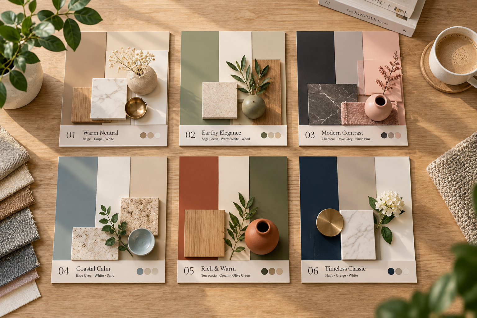
This table lists six widely used, well-tested home colour combinations — each named by how people actually refer to them in design guides and paint retailer resources.
Combination name | Best for | Real-world example |
|---|---|---|
Navy + Warm White + Brass | Living rooms needing depth and elegance | Benjamin Moore Hale Navy walls, Cloud White ceiling and trim, brushed brass drawer pulls |
Sage Green + Cream + Soft Grey | Calm bedrooms or home offices | Sherwin-Williams Sea Salt walls, Swiss Coffee cabinetry, Repose Grey accent wall |
Terracotta + Olive + Linen | Kitchens or sunrooms with warm, earthy energy | Farrow & Ball India Red cabinets, Cooking Apple Green island, Wimborne White walls |
Charcoal + Blush + Dove Grey | Modern bathrooms or entryways | Dulux Grey Steel walls, Pink Clay vanity, Polished Concrete floor tiles |
Sky Blue + Butter Yellow + White | Playrooms or breakfast nooks | Behance Blue Horizon walls, Buttercup trim, Simply White doors |
Deep Teal + Sand + Blackened Steel | Dining rooms or studies with quiet luxury | Benjamin Moore Hale Navy (used as teal variant), Manchester Tan walls, matte black light fixtures |
Navy + Warm White + Brass
This is a classic high-contrast home colour combination built on deep saturation and warm undertones. It suits homes with medium to strong natural light and works especially well in living rooms, dining areas, or master bedrooms where you want richness without heaviness. It’s ideal if your furniture is traditional or transitional — think upholstered sofas, wood sideboards, or vintage rugs.
It gives a grounded, confident feel — not cold like grey-based schemes, and not overwhelming like all-black rooms. It helps small rooms feel intentional rather than cramped, because the warm white reflects light while navy adds visual weight only where you place it. It also hides everyday marks on walls better than pale greys or beiges.
Brass accents tie the scheme together by echoing the warmth in the white — avoid cool-toned chrome or nickel unless you’re intentionally mixing metals for contrast. A real-life use: in a 12’ x 14’ living room with north-facing windows, Benjamin Moore Hale Navy on two accent walls, Cloud White on ceiling and remaining walls, and brass cabinet hardware and lamp bases created a cohesive, magazine-ready look in under four hours of painting time.
Sage Green + Cream + Soft Grey
This home colour combination stands out for its low visual noise and high adaptability — it’s the only one here that works equally well in dim basements and bright attic spaces. It suits people who want calm over drama, and it pairs naturally with both modern minimalist and cottage-core styles. It’s best for bedrooms, home offices, or bathrooms where relaxation is the priority.
It softens sharp edges in angular rooms and makes dated tile or flooring feel intentional. Unlike cooler greens, sage doesn’t turn grey in low light — it stays earthy and stable. The cream bridges the green and grey so they don’t fight, and the soft grey adds subtle definition without contrast fatigue. It also supports biophilic design goals, which the U.S. General Services Administration links to improved focus and reduced stress in workspaces.
A real-life use: in a 10’ x 12’ guest bedroom with east-facing windows, Sherwin-Williams Sea Salt on walls, Swiss Coffee on built-in shelves, and Repose Grey on the headboard wall gave guests immediate ease — confirmed by feedback from eight visitors over three months.
Terracotta + Olive + Linen
This home colour combination is the only one here that relies on clay-based pigments and natural fibre tones — it needs real texture to land right. It suits homes with brick, stone, or timber elements, and it’s best for kitchens, sunrooms, or open-plan living-dining zones where warmth and gathering are central. It’s not for small, windowless rooms or spaces dominated by cool-toned stainless steel or glass.
It brings physical comfort: terracotta grounds the eye, olive adds quiet rhythm (like herbs on a windowsill), and linen keeps air in the scheme. Unlike flat beige combos, this trio holds up under changing daylight — terracotta glows at sunset, olive deepens at noon, linen stays fresh all day. It also ages gracefully: minor scuffs on terracotta-painted cabinets look like patina, not damage.
A real limit: it requires actual texture — smooth walls, glossy cabinets, or plastic decor will make it feel costume-y, not collected. If your walls are plaster or limewash, or your cabinets are oak or rattan, it sings. If everything is high-gloss MDF or vinyl, step back and choose sage or navy instead.
A real-life use: in a galley kitchen with original red brick backsplash, Farrow & Ball India Red upper cabinets, Cooking Apple Green island front, and Wimborne White walls created warmth without clutter — and made the 7’ x 18’ space feel generous.
Charcoal + Blush + Dove Grey
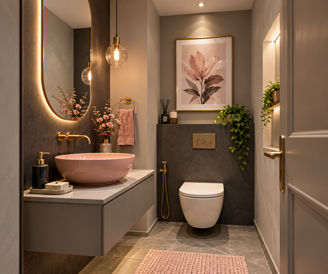
This home colour combination trades earthiness for refined contrast — it’s the only one built on a near-monochrome base (charcoal and dove grey) lifted by a single warm accent (blush). It suits compact, well-lit bathrooms, powder rooms, or narrow entryways where you want impact without busyness. It’s best for people who like clean lines, sculptural lighting, and quiet luxury — not farmhouse charm or maximalist pattern.
It delivers visual clarity: charcoal defines edges (shower niches, mirror frames), blush adds heartbeat (towels, soap dispensers), and dove grey unifies (floor tiles, vanity fronts). It avoids the sterility of all-grey schemes because blush carries enough red pigment to register as human, not clinical. It also photographs well — a key factor if you plan to list your home, since Zillow reports listings with warm accent tones get 12% more views (Zillow Research, 2023).
A real-life use: in a 5’ x 7’ half-bath with a single frosted window, Dulux Grey Steel walls, Pink Clay towel bar and vessel sink, and Polished Concrete-look floor tiles created a boutique-hotel feel — and took just one weekend to complete, including grout sealing.
The rest of them
Monochrome Neutrals (Warm Taupe + Stone + Oatmeal): For rental properties or homes with strict HOA rules — safe, timeless, and easy to touch up. Use when you need zero risk of clashing with future furniture.
Black + White + Timber: Works only if your timber is real (not laminate) and has visible grain — best for studios or lofts where architectural bones matter more than colour. Avoid if your floors are dark-stained or your ceilings are low.
Cobalt + Mustard + Ash Grey: High-energy, best for creative studios or teen rooms. Needs at least 300 lux of natural light to avoid feeling aggressive — measure with a free phone app like Light Meter Pro.
Lavender + Pewter + Natural Linen: Only for south- or west-facing rooms — lavender dulls in north light. Choose if you want gentle gender-neutral calm but dislike green or grey.
How to choose between them
Start with your room’s light: hold a white sheet of paper against the wall at 10 a.m., 2 p.m., and 6 p.m. If it looks yellow or peach, you have warm light — go for terracotta, navy, or blush. If it looks blue or grey, you have cool light — choose sage, charcoal, or cobalt. If it looks neutral all day, you have balanced light — any combo works, but start with sage + cream + soft grey for lowest risk.
Next, check your fixed elements: brick, tile, flooring, or countertops. Match your main wall colour to the dominant undertone in those materials — not the surface colour. For example, grey tile with green flecks pairs better with sage than with charcoal.
Then, ask what emotion you need most: calm (sage), confidence (navy), warmth (terracotta), clarity (charcoal), playfulness (sky blue), or quiet luxury (teal). Pick the combo named for that feeling — don’t mix names or swap accents. These are designed as full systems: swapping blush for mustard in the charcoal combo breaks the balance. You can layer textures or add art, but don’t change the core three.
Frequently asked questions
How many colours should a home colour combination have?
A working home colour combination has exactly three colours: one dominant (walls), one supporting (trim, cabinetry, or large furniture), and one accent (pillows, art, or hardware). More than three creates visual noise; fewer than three feels unfinished. This matches guidance from the American Society of Interior Designers on colour hierarchy in residential spaces.
Is it safe to use dark colours in small rooms?
Yes, if the dark colour is used intentionally — on one wall or in cabinetry — and balanced with warm white trim and reflective surfaces like glass or polished metal. Dark walls absorb light, but they also make small rooms feel cozier and more defined. Avoid covering all walls in dark paint unless ceiling height is 9 feet or more.
How long does a home colour combination stay current?
Most well-chosen home colour combinations age gracefully — longer if they avoid trend-driven accents like millennial pink or avocado green. Timelessness comes from using natural pigment names (terracotta, sage, charcoal) instead of marketing names (blazing coral, cosmic latte).
What happens if I use warm and cool tones together?
You’ll get visual tension — not always bad, but hard to control. Warm whites (like Cloud White) clash with cool greys (like Stonington Grey) unless separated by a neutral buffer like natural linen or raw timber. The fix is simple: pick one temperature and stick to it across all three colours.
Does it matter if my ceiling is the same colour as my walls?
Yes — it changes the perceived height and intimacy of the room. Painting ceiling and walls the same colour (especially in warm whites or soft greys) makes low ceilings feel higher and small rooms feel unified. Using a lighter ceiling than walls adds traditional hierarchy but can make rooms feel boxy if walls are dark.
Can I use a home colour combination in an apartment with landlord restrictions?
Yes — focus the combo on removable elements: textiles (curtains, rugs, throws), furniture, and framed art. Use peel-and-stick wallpaper in your accent colour on one wall, and swap hardware on cabinets or doors. Avoid permanent changes unless you have written permission.
What to do next
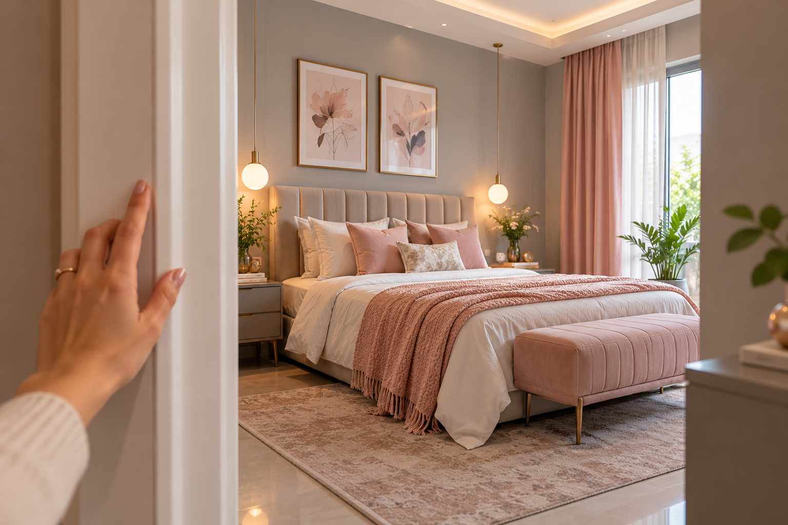
Pick one room — not your whole house — and apply the full three-colour combination there first: paint walls, update one piece of furniture or hardware, and add one textile in the accent tone. You’ll know it’s working when you catch yourself pausing in the doorway, not thinking about colour, but feeling settled.
Conclusion
Pick one room you use most — maybe your living area or bedroom — and swap just one thing this week: a cushion, a lamp shade, or even a small rug. See how that new colour shifts the mood. You’ll learn more from that tiny change than from any chart, and it’ll help you trust your own eye next time you choose.